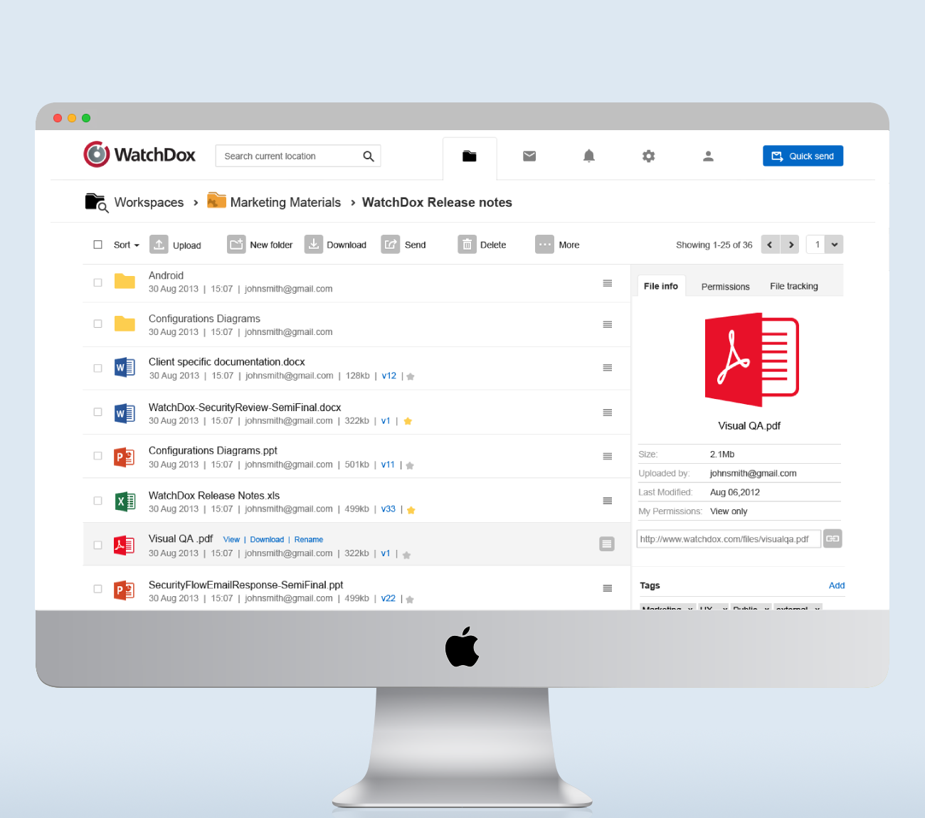
WATCHDOX (ACQ BY BLACKBERRY)
WatchDox enabled Fortune 500 companies to securely share, manage, and collaborate on sensitive files across devices. After several years of strong enterprise adoption, the company was acquired by BlackBerry.
- Redesigned the core security workflow across 5 platforms (Web, Mac, Windows, iOS, Android), transforming a dense UX into a simple, intuitive model.
- Delivered a unified cross-platform product experience while preserving native patterns.
- Improved usability to the point that a leading U.S. consulting firm awarded the redesigned product a top-tier evaluation score.
- Supported product adoption and scale, contributing to WatchDox’s acquisition by BlackBerry.
DETAILS
| Years: | 2012-2014 |
| My title: | Senior UX designer |
| Responsibilities: | UX, UI, User research, Front end development |
THE CHALLENGE
MAKING ENTERPRISE-GRADE SECURITY FEEL SIMPLE
When I joined WatchDox, the product was technically robust but had been designed primarily by engineers. The result was a powerful yet clumsy experience that made secure file sharing unintuitive and difficult to navigate.
Enterprise users needed to manage thousands of files across teams, departments, and devices while handling complex security rules, access controls, and audit trails. The UX was far from supporting that reality.
Cross-platform consistency added another layer of complexity. Because our Fortune 500 clients used everything from web apps to Mac, Windows, iOS, and Android, we maintained fully native applications for each platform. Creating a cohesive experience while respecting native UI patterns across five platforms was a major challenge, especially in workflows tied to security.
APPROACH
SECURITY FIRST, WITHOUT THE CLUTTER
My first task was to rethink the UX around security, the core value of the product and also its most difficult area for users.
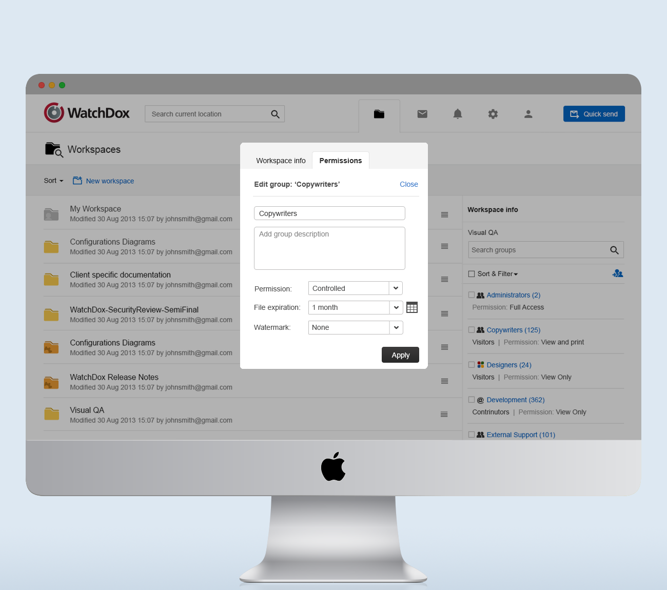
I conducted research with current customers and internal experts to understand how people navigated permissions, classifications, and expiration settings. It became clear that the interface exposed too many decisions, too early, in too many places.
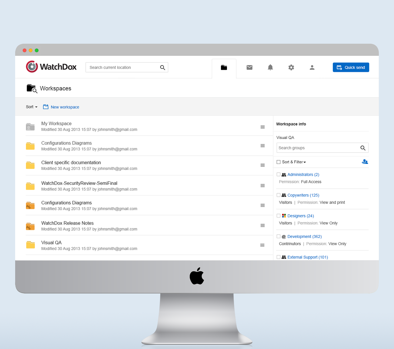
Parallel to that, I worked on simplifying the overall information architecture and improving coherence across our native applications. Because we could not disrupt current enterprise customers with a jarring redesign, I placed strong emphasis on improved onboarding and transitional UX.
THE RESULT
A STREAMLINED EXPERIENCE THAT SUPPORTED GROWTH AND ACQUISITION
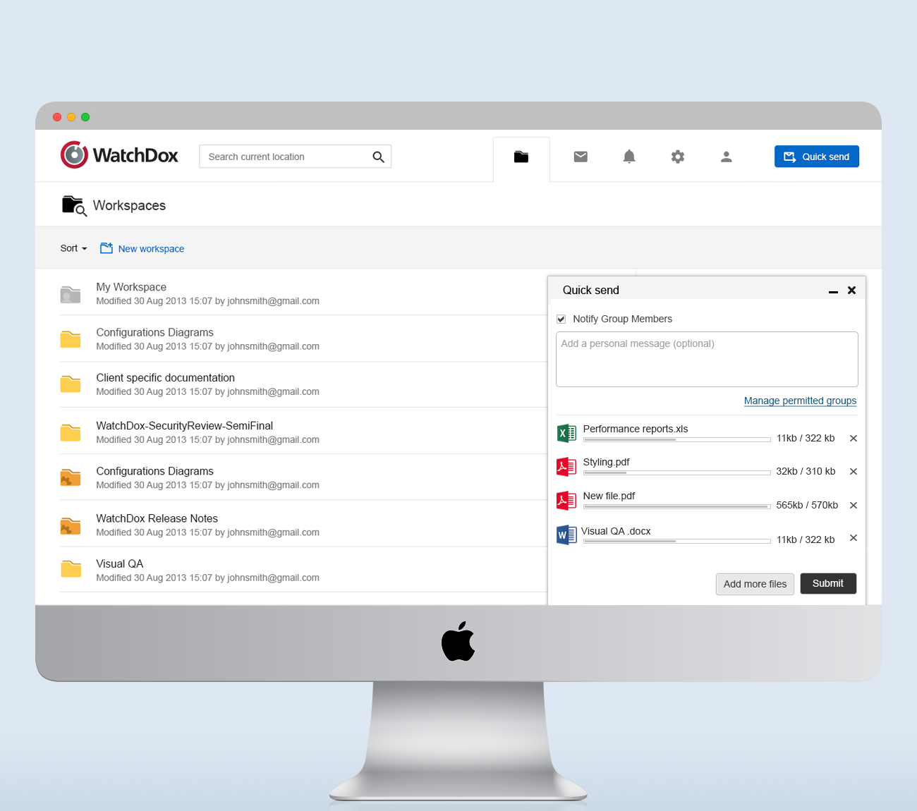
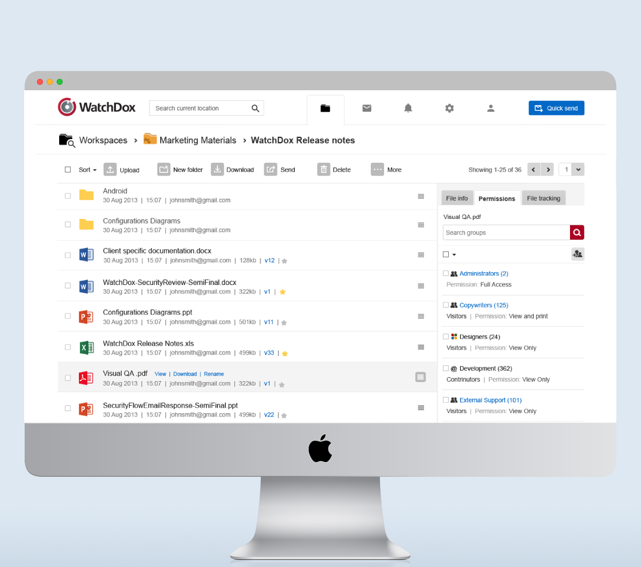
Working closely with engineering and product, we redesigned the platform across all five environments: Web, Mac, PC, iOS, and Android - balancing native components with a unified experience. The biggest win was transforming one of the most complex parts of the product: security settings.
What was once a dense, intimidating page full of granular controls was redesigned into three clear dropdowns with well-defined security templates. This became one of the signature improvements that helped users feel confident and in control.
A leading U.S. consulting firm later validated the redesigned product through a formal usability assessment, awarding it a top-tier score.
The improved UX supported broader product adoption and ultimately contributed to the company’s successful acquisition by BlackBerry.
