RAN'S WORLD
A strategic repositioning of a 30-year artistic practice into a product-driven, character-based brand that resonates with a new generation of collectors.
DETAILS
| Years: | 2021–Present |
| My role: | Founder, Artist, Product & Brand Designer |
| Responsibilities: | Brand strategy, product strategy, UX/UI, e-commerce design, visual design, storytelling, character development, illustration, customer research |
THE CHALLENGE
REPOSITIONING A 30-YEAR ART PRACTICE FOR THE RIGHT AUDIENCE
For decades I created art without selling it directly. When I finally launched my first DTC site under Ran Kunst, I positioned myself as a contemporary fine artist: exclusive originals, gallery-centric storytelling, and the traditional modern-art tone.
But as I began seeing real-world engagement - through art fairs, shows, and conversations - a very different insight emerged:
The people who truly connected with my work weren’t traditional art buyers.
They were younger, expressive, character-driven audiences who wanted accessible editions, not high-priced originals.
The result was a clear positioning gap: the brand was speaking to an audience I wasn't actually serving, and the audience that did love my work didn’t feel the brand was speaking to them.
This created a strategic opportunity:
Evolve from “artist in the fine-art world” into a character-led creative universe with tiered product offerings without losing artistic integrity.

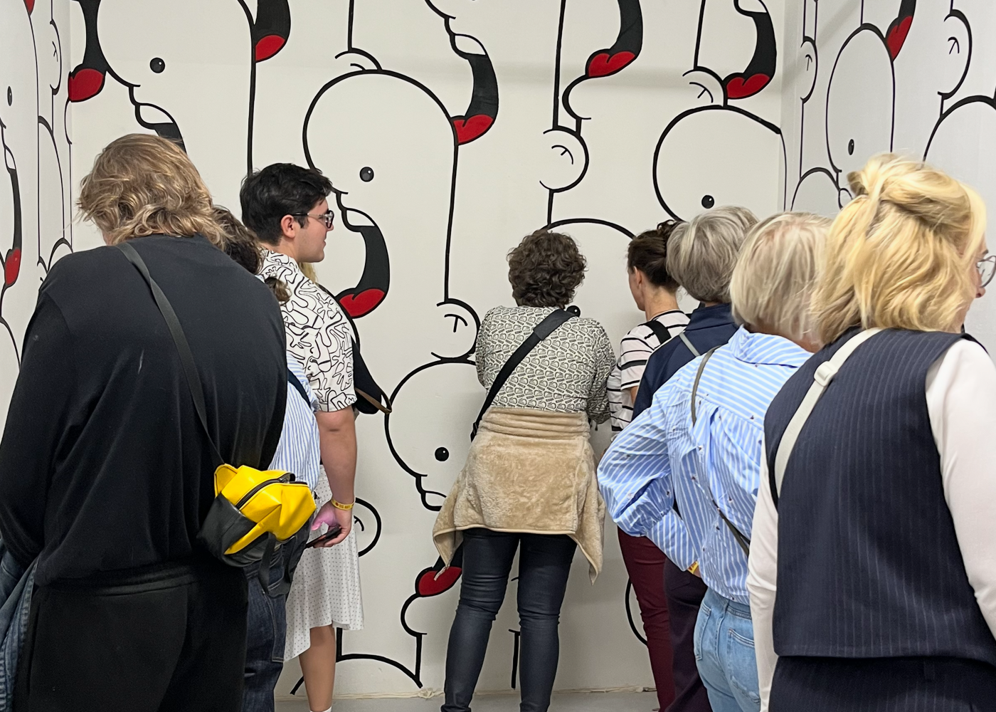
My partitipation in BIGART 2025 proved my assumptions about my audience
APPROACH
BUILDING A WORLD, NOT JUST A PORTFOLIO
To bridge the gap between my work and the people who resonated with it, I reimagined the entire brand from the ground up. This included:
- Rebranding to RansWorld - shifting from “Ran Kunst, fine artist” to a broader character-based universe with its own narrative identity.
- Leaning into the characters I’ve been developing for over 20 years, giving people emotional anchors and recognizable personalities to connect with.
- Restructuring the product strategy around accessibility, collectibility, and clear audience pathways.
- Redesigning the UX so visitors immediately understand the world, categories, and entry points.
- Creating a system that allows the brand to scale: more characters, more editions, more formats.
The goal was simple:
Preserve the craft of original art while expanding the brand into something approachable, collectible, and engaging.

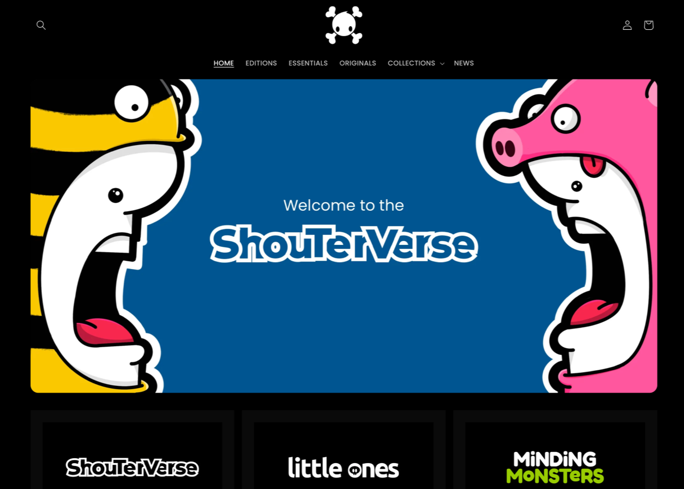
The new site places a lot of emphasis on the characters
PROCESS
FROM FINE ART TO A SCALABLE, CHARACTER-DRIVEN BRAND
Reframing the brand identity
The name RansWorld became the foundation for everything, a universe rather than a single artist. This opened the door for:
- Character families
- Story worlds
- Sub-collections
- Future collaborations
- More scalable product lines
The design system moved away from the gallery-white look toward a warmer, more inviting experience.
Building a tiered product structure
To align with customer behavior and purchasing power, I redesigned the product offering into three clear categories:
- Editions - Limited edition prints and collectible art, designed for affordability, collectibility, and repeat purchases.
- Essentials - Apparel, merch, stickers, small-format items, tying the characters to everyday life, allowing fans to “carry the world” with them.
- Originals - One-of-a-kind paintings, maintaining artistic depth and long-term collector value.
This new structure acts like a funnel — from casual fans to collectors to art buyers.
Elevating the characters
Many pieces from the last two decades were built around characters, but the original brand didn’t make that explicit.
RansWorld changed that by:
- Grouping characters into families
- Giving them personality and backstory
- Incorporating them into product lines
- Using them to differentiate editions
- Creating emotional continuity across the site
This transformed the artwork from “pieces” to “a world you can belong to.”
Redesigning the website for clarity & connection
The new site focused on:
- Clean navigation across the three product tiers
- Stronger storytelling
- Improved merchandising
- Simplified paths to purchase
- Higher visibility of editions (the most in-demand category)
Everything revolves around helping people understand the world quickly and then connect with the characters emotionally.

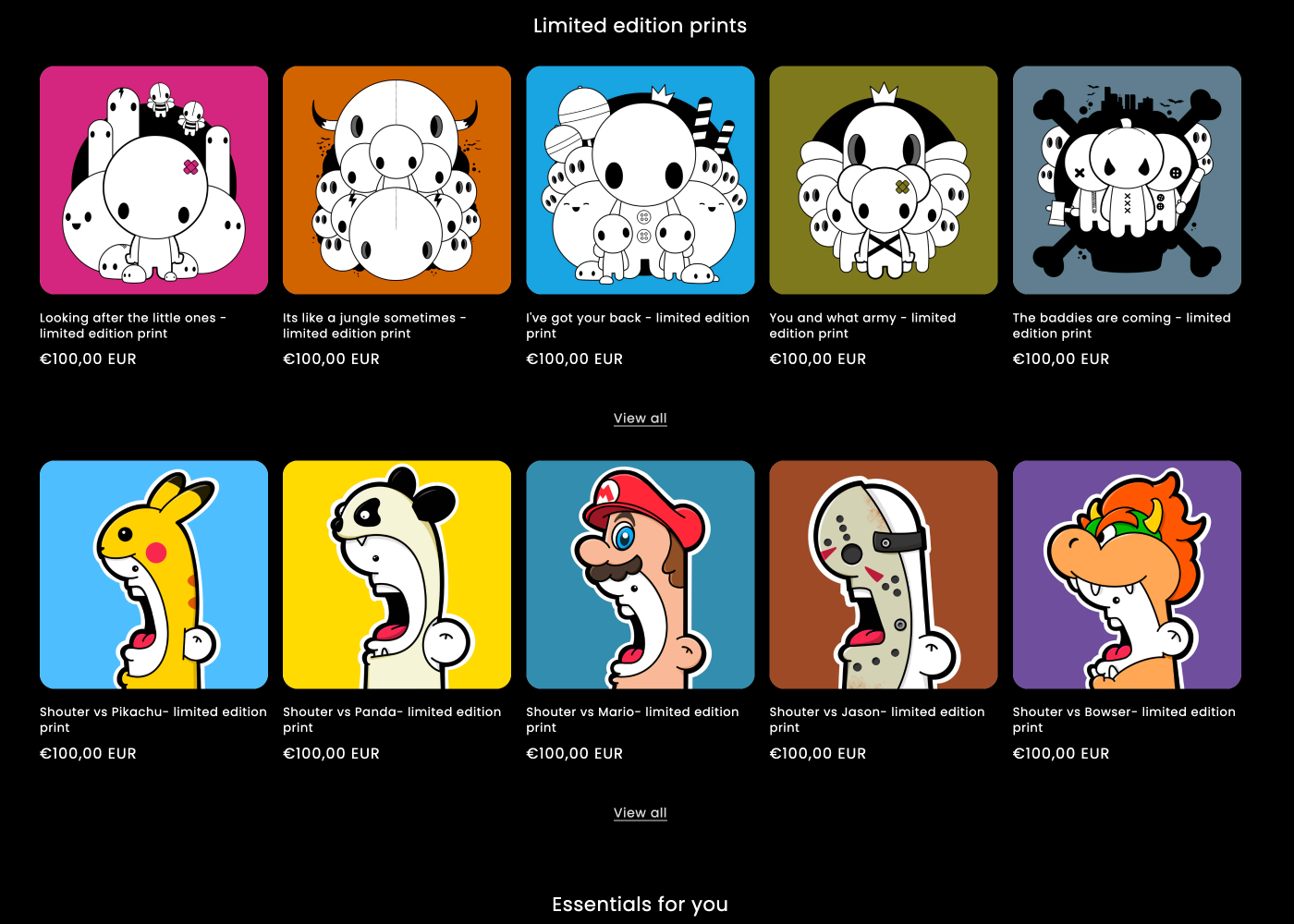
The main page now mainly promotes editions and essentials
THE RESULT
A CLEAR, ENGAGING, AND PROFITABLE NEW BRAND DIRECTION
Although the new site has only been live a short while, the impact is already visible:
- Editions sales are up - confirming that the new target audience and category structure align with real demand.
- Younger audiences understand the world immediately, leading to stronger engagement and repeat visits.
- The brand now mirrors the true essence of the art - colorful, character-driven, expressive, and emotionally relatable.
- The repositioning set the foundation for future expansion, including story development, animations, collaborations, and new product lines.
What began as a shift in design became a strategic realignment of identity, positioning, and market fit. RansWorld is no longer just a portfolio, it’s a world.
